Set It and Forget It Data Integration
Stitch, acquired by Talend, is a cloud-first, developer-focused platform for rapidly moving data.
Our mission at Stitch was to inspire and empower data-driven people. This meant giving data teams better access to data that was siloed in web-based tools and services, across their organization. The platform allows data teams to quickly and accurately send analytic-ready data, from any enterprise application or data source, to a data warehouse for analysis.
As the sole UX practicioner on the project, I worked closely with product management, engineering, and leadership to craft an experience that would guide people through the process of integrating and managing their analytic data pipeline.
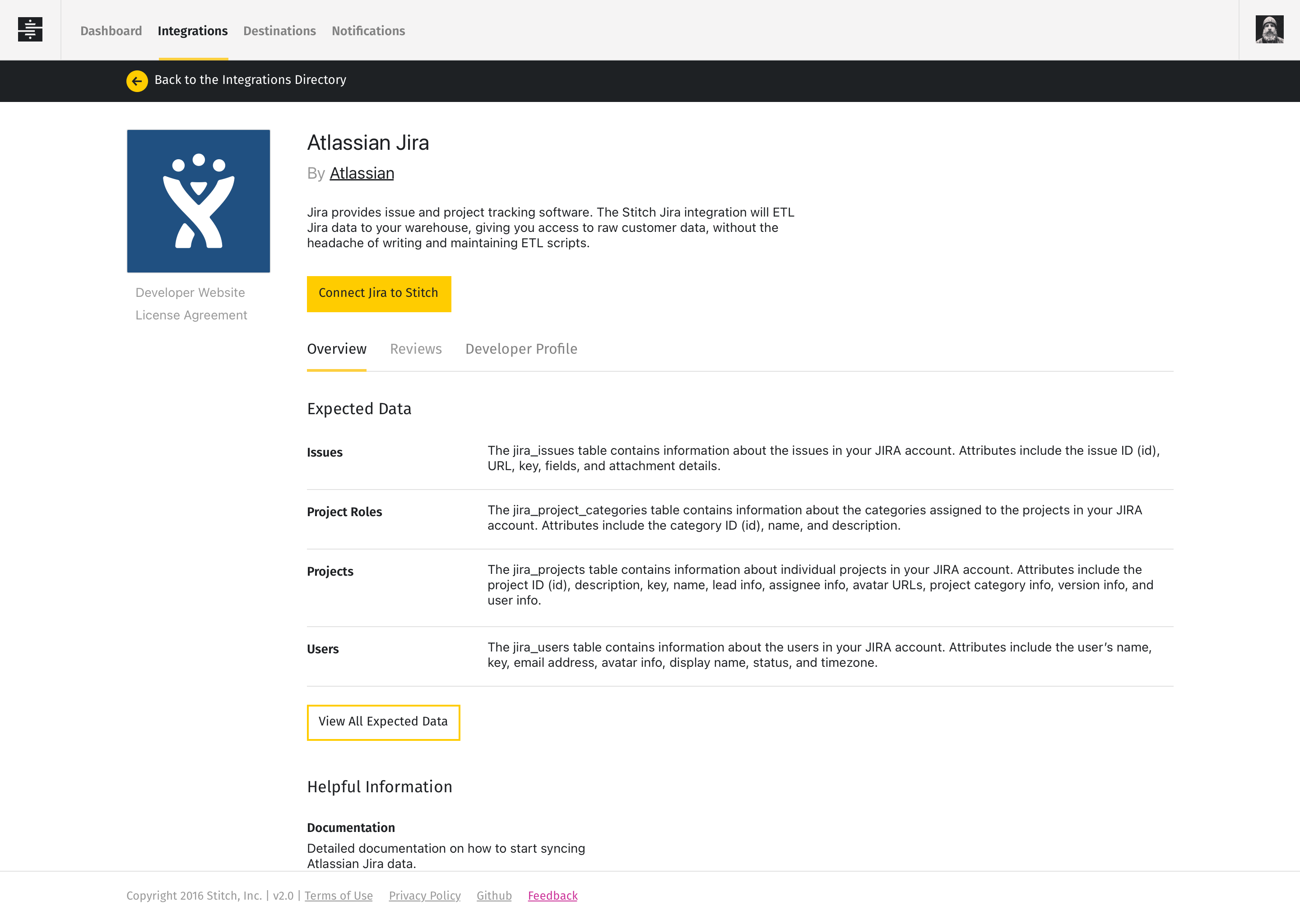
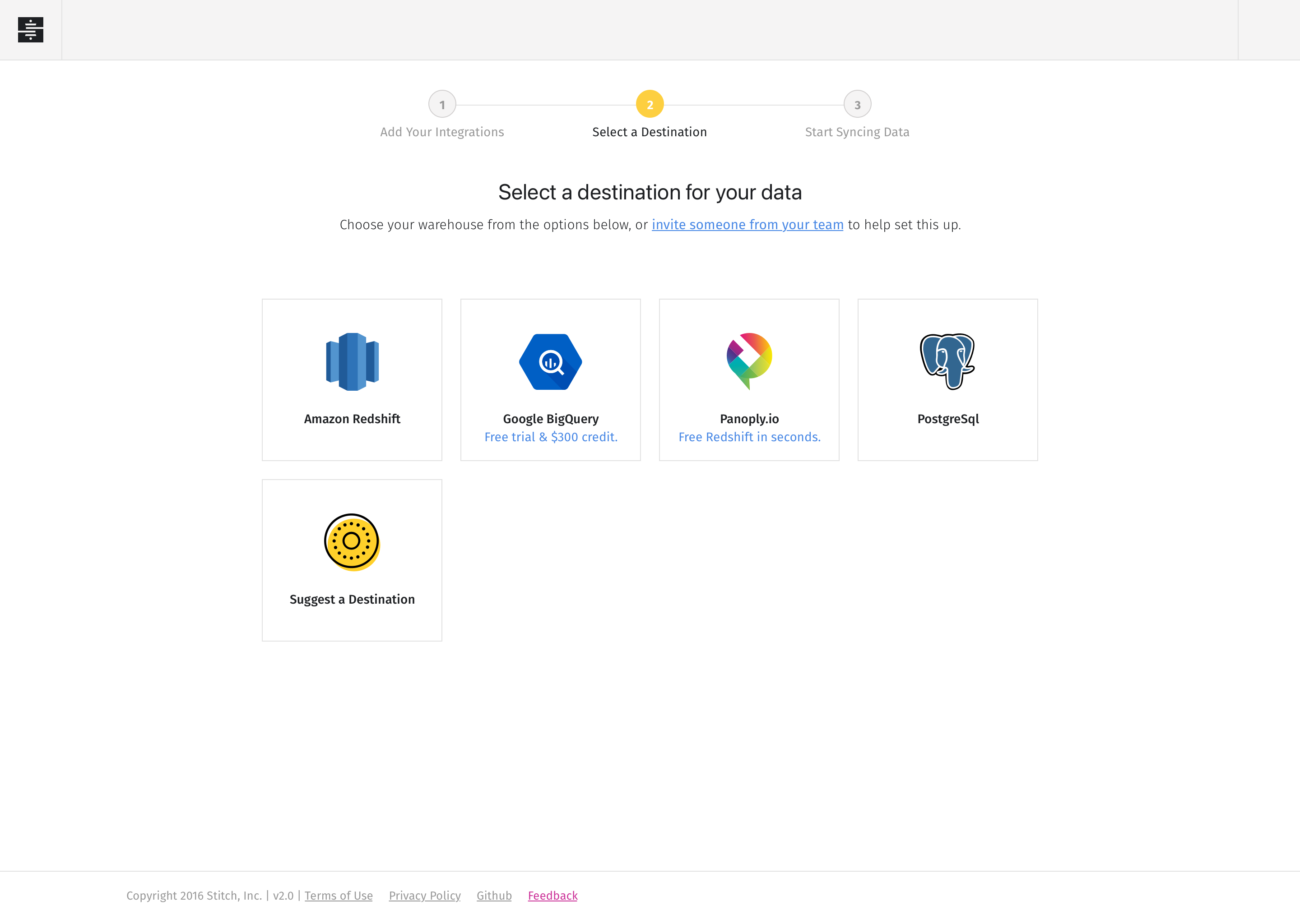
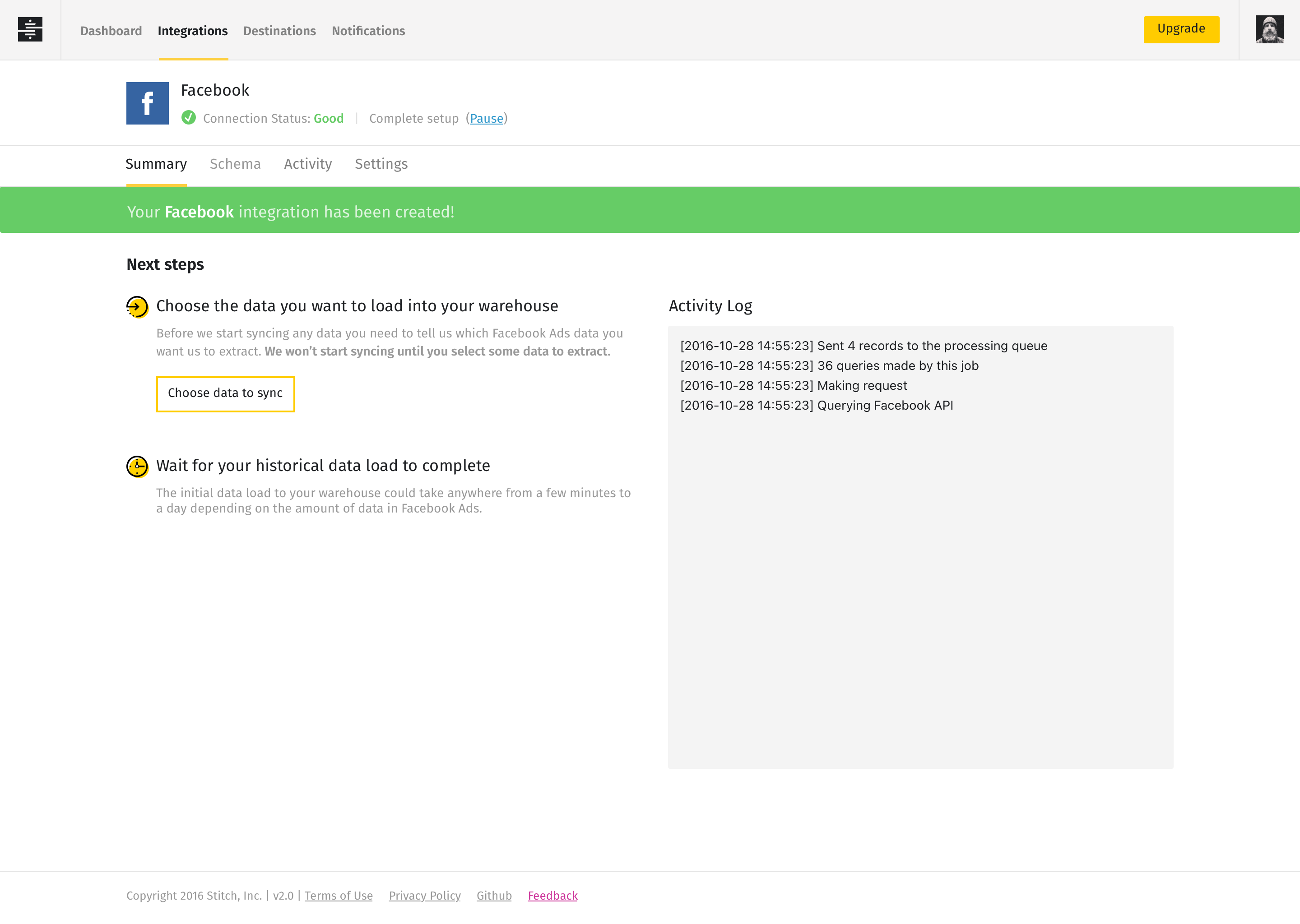
With an extensive set of pre-built integrations, the onboarding process allowed users to quickly find and configure integrations with popular web-based tools. Enabling people to immediately gain access to their data gave them a quick win and instantly spoke to the platform's ease of use.
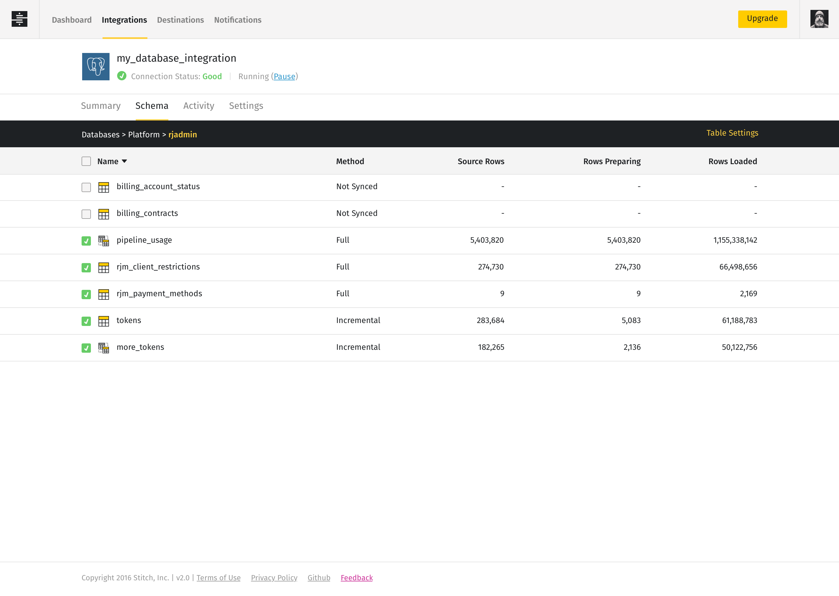
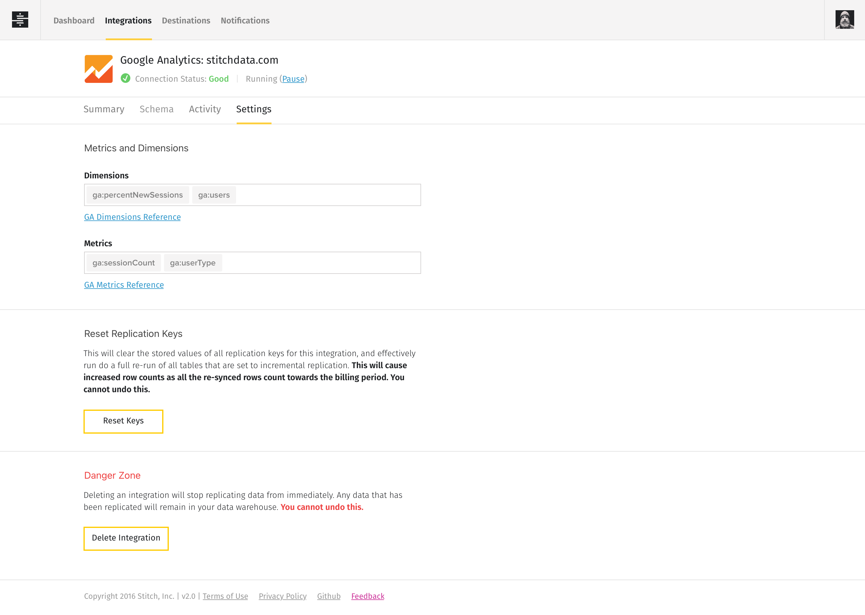
Once an integration was configured, we provided a simple set of tools for users to fine-tune their integration by customizing their data schema and setting integration specific settings. Users could choose to integrate entire models, or select individual objects, giving them complete control over what data made it into their warehouse.
Keeping users informed of how data was moving through the data pipeline was very important to us, especially since some large data transfers could take up to a day to complete. The Summary tab played an important role in nurturing users through the setup process and provided a space for users to check in on the progress of their initial data transfer. Over time, the Summary tab provided a data-rich dashboard that gave users an at-a-glance view of how their integration was performing over time.
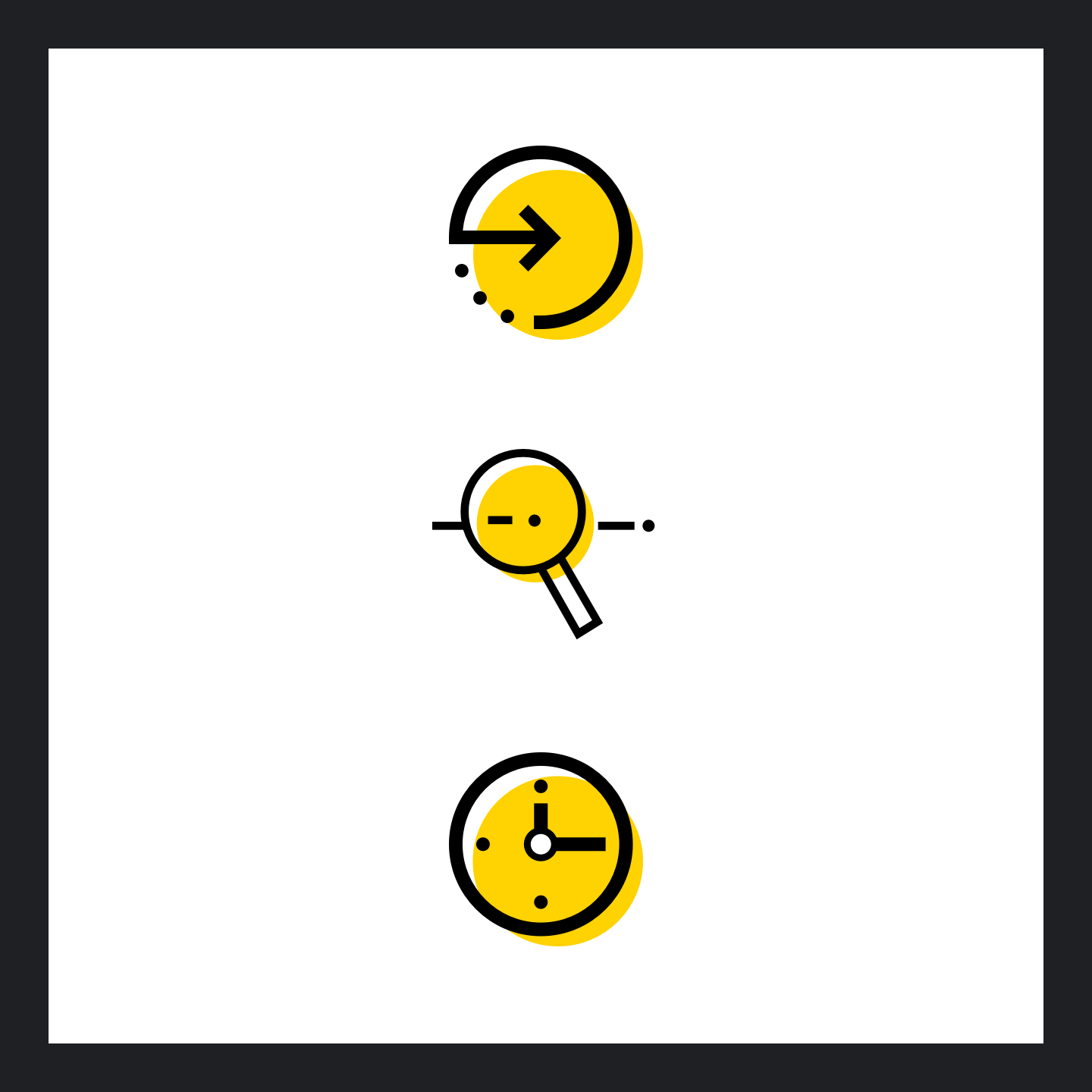
Every element of the Stitch user experience was crafted to incorporate the Stitch brand. From the design of data visualizations, to icons and spot illustrations, each element of the user interface was a direct extension of the brand... right down to the loading screens.
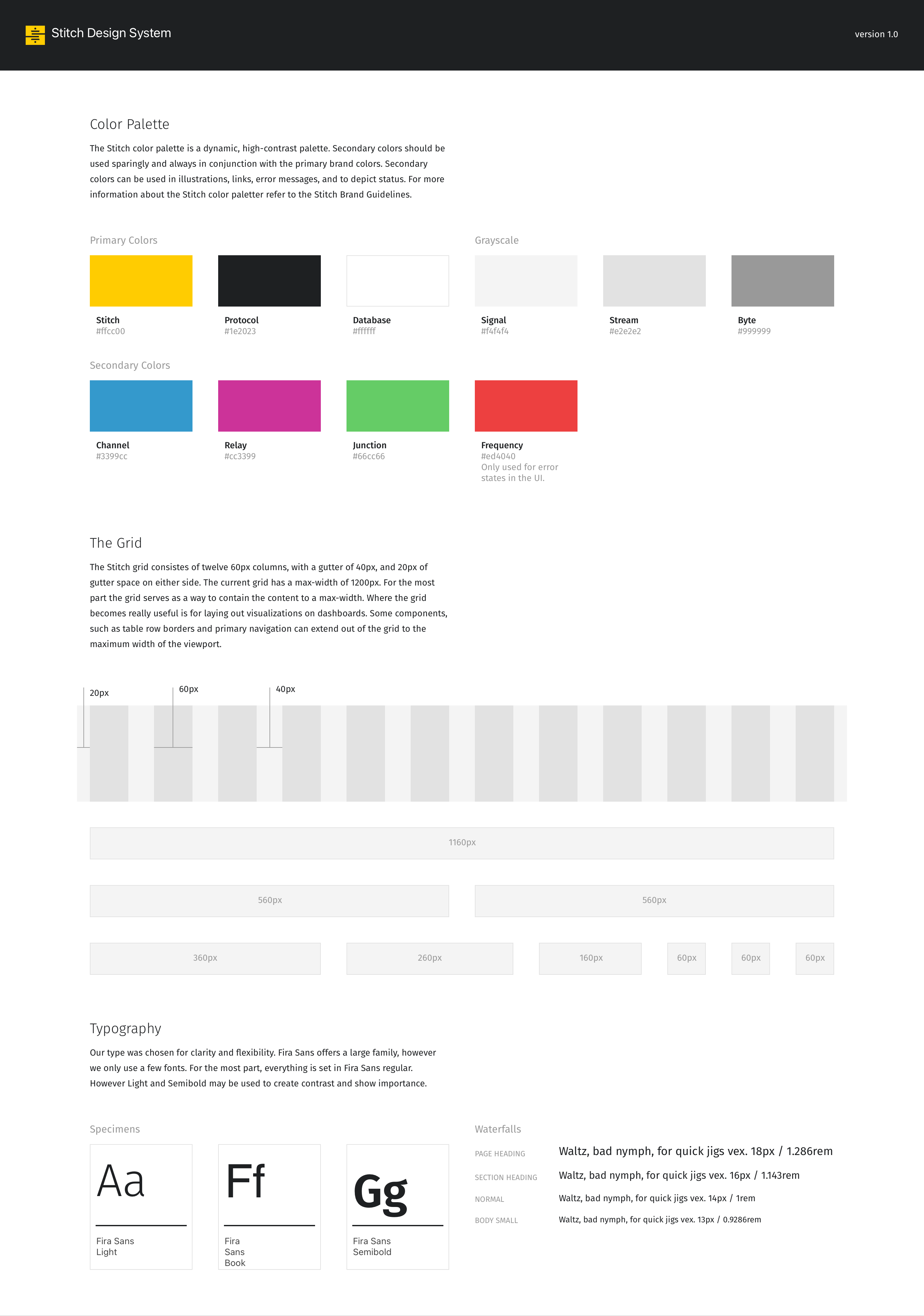
The Stitch design system was created to ensure that both engineering and design teams shared a common language when creating visual elements in the UI. As a UX Team of One the design system also allowed for rapid prototyping and iteration, with each element of the UI available immediately in our Sketch libraries.
